
This Quick Google Data Studio Tutorial Will Get You Started in No Time
Get Started in 10 Minutes or Less
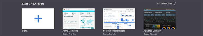
1. Log into Google Data Studio and start a new blank report
While Google Data Studio templates can be useful, they may not always apply to your unique needs. If you’re concerned that your report isn’t going to be as beautiful as the default Google Data Studio templates, fear not. It’s more important to have the correct data in your reports than it is to have a good looking report. Having the correct data on the page in a way that is digestible should supersede a beautiful design. You can always go back and beautify your report after you get the right data on the page.
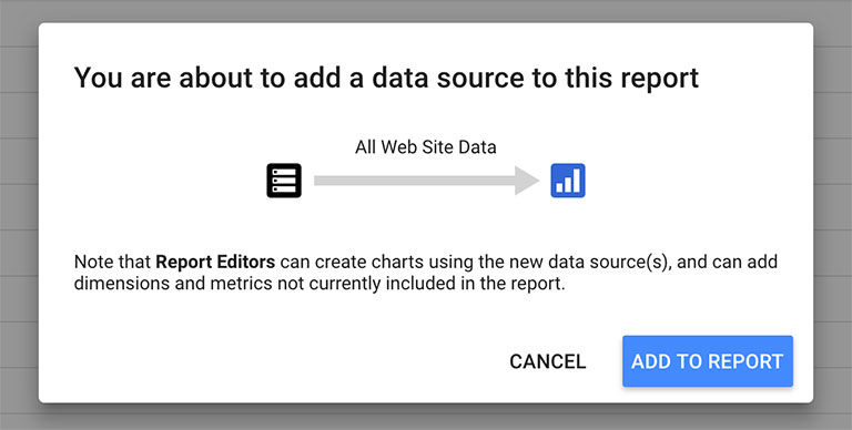
2. Connect a Data Source to your new report
After creating your new blank report, you should be prompted to “Add a data source.” The data source is just as it’s name implies. Your data source provides the data that you will use in your report. You can use multiple data sources for a single report; including Google AdWords, Google Search Console, Google Analytics, Google Sheets and more. Click “Create a New Data Source”. Choose “Google Analytics”, your account, your property, and your view. Click “Connect”, then click “Add to Report” to add the listed fields to your report. You can now access your Google Analytics data from Google Data Studio.
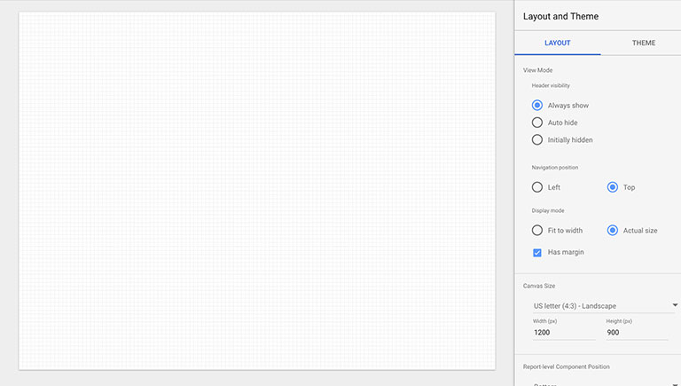
3. Choose your layout and setup your theme
Set your report dimensions, fonts, and colors. Keep in mind that if you are intending to print these reports, choose the appropriate paper dimensions under “Layout > Canvas Size.” Once your basic layout and theme are setup, it’s time to start adding data to our report.
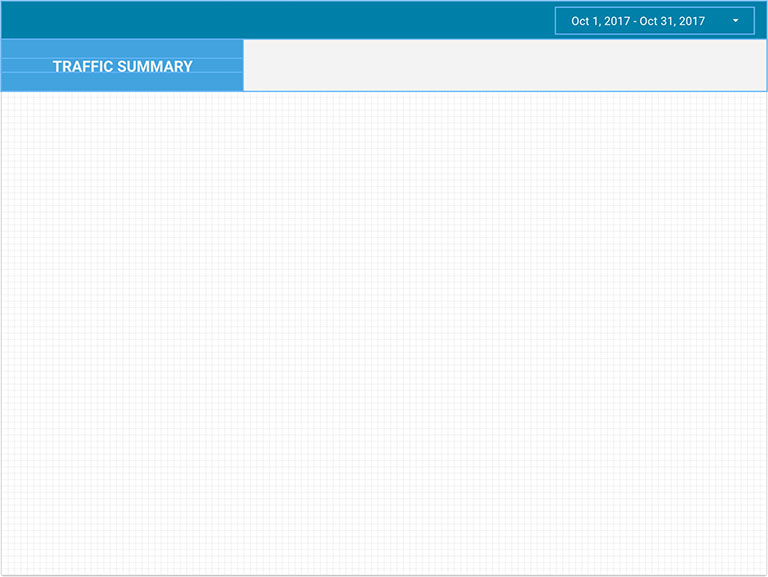
4. Setup your generic styles and page title
Create a generic style for your pages to keep your report readers organized. I like to create a page title area (Insert > Text), some rectangles to create some distinction between my title area and the report area, and a date range toggle (Insert > Date range). If you need to move elements on top of or behind other elements, navigate to “Arrange > Order” and select the appropriate option. Note: Photo shows all elements selected.
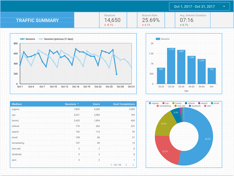
5. Insert your data
How you choose to display your data is entirely up to you. You can reference some of the default Google Data Studio templates for some ideas. It’s important that you only list the most important data. The point of Google Data Studio is to consolidate your data and generate reports in a consistent, visual way that is easy to understand. In this Google Data Studio tutorial, we’re only going to cover the most common chart types. Let’s get started.
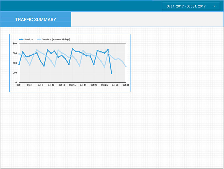
A. How to Insert a Time Series
Click “Insert > Time Series” and click and drag on your report to insert a Time Series chart. Under the “DATA” tab on the right-hand side of your page, ensure that you’re connected to the correct data source. Select your Time Dimension. “Date” is usually appropriate for this type of chart. Next, select the metric that you would like to track over time. Optionally, you may set the chart to compare and display current data with your previous period. Finally, click on the “STYLE” tab and style your chart to your liking.
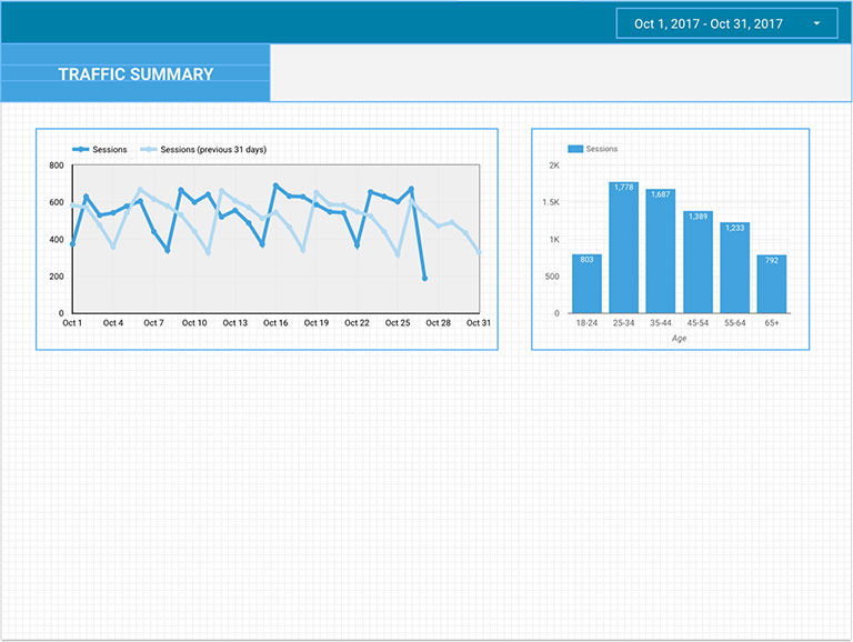
B. How to Insert a Bar Chart
Click “Insert > Bar Chart” and click and drag on your report to insert a Bar Chart. Select your data source, dimension, metric, and sorting method. Style your bar chart as you would like by clicking on the “STYLE” tab. Here you can choose where you’d like your bar chart to be horizontally or vertically oriented.
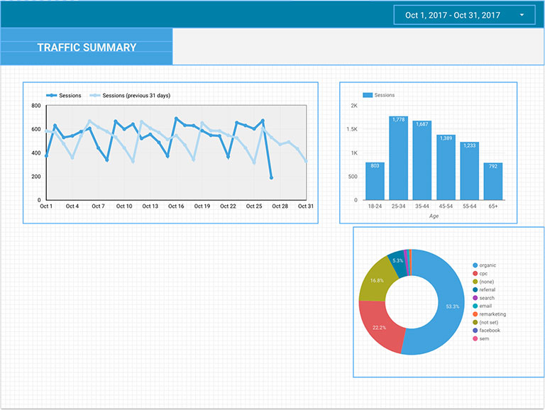
C. How to Insert a Pie Chart
Click “Insert > Pie Chart” and click and drag on your report to insert a Pie Chart. Select your data source, dimension, metric, and sorting method. Explore the available styles in the “STYLE” tab.
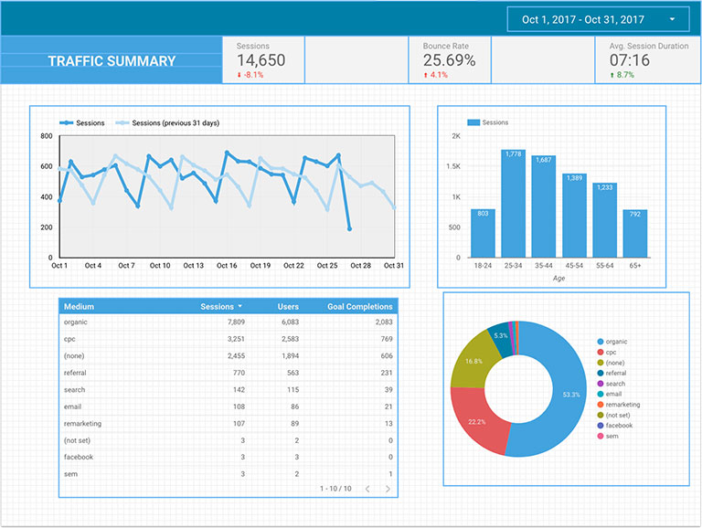
D. How to Insert a Table
Click “Insert > Table” and click and drag on your report to insert a Table. Select your data source, dimension, metric(s), and sorting method. Tables are a great way to compare multiple metrics to one or more mediums. Try not to get too carried away making tables. You can easily overcomplicate a table. Explore the available styles in the “STYLE” tab.

E. How to Insert a Scorecard
Click “Insert > Scorecard” and click and drag on your report to insert a Scorecard. Select your data source, dimension and metric. Scorecards are a great way to highlight a specific, important metric. Explore the available styles in the “STYLE” tab.
6. Clean up your page using Arrange
You can resize, reshape, and reorganize your page using options within the “Arrange” menu item. To do so, select multiple page elements by holding shift and clicking the elements or by clicking and dragging over elements. Once selected, click “Arrange” in the menu and align, distribute, or group your items.
7. Celebrate with donuts and cervezas.

Obviously, this was a very basic Google Data Studio tutorial, but there are nearly limitless uses for Data Studio. Features not mentioned in this tutorial include filters, custom metrics, segments, metric calculations, and many more. You can even pull and segment your Google Analytics events that you created in our Google Tag Manager guide.